Ramblings About the Ring of Heroes Portal Masters Part 4: Ryeo
(This is a cleaned-up repost of a series of essays I wrote in 2022)
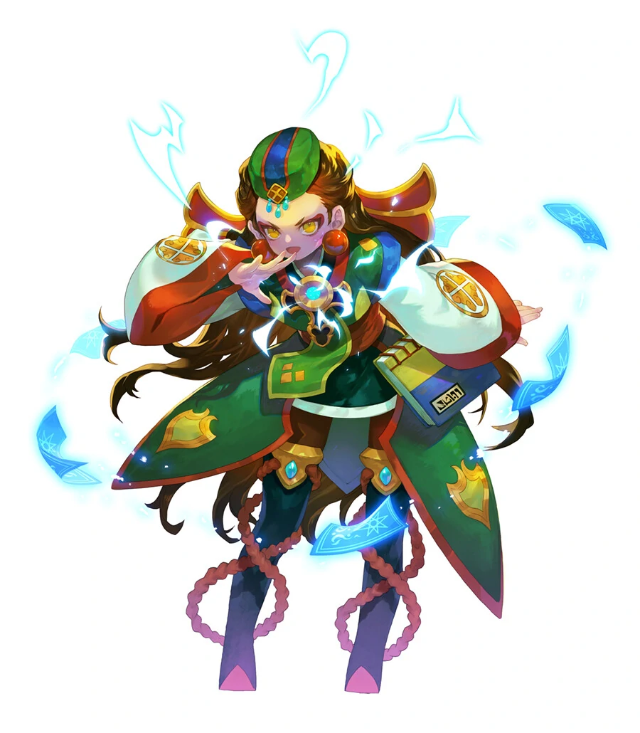
For this section, I will be talking about Ryeo, Prophet of the East and the second original portal master introduced in the revamp. A prospective fortuneteller with an affinity for tarot who desires nothing more than to learn the secrets that the future holds, and who refuses to give up despite her constant blunders and blatant inability to properly see the future. This passionate, fiery young lady wields her cards both as a tool and a weapon, channeling her innate passion into them to support her Skylanders on the battlefield through her skilled use of her special cards.
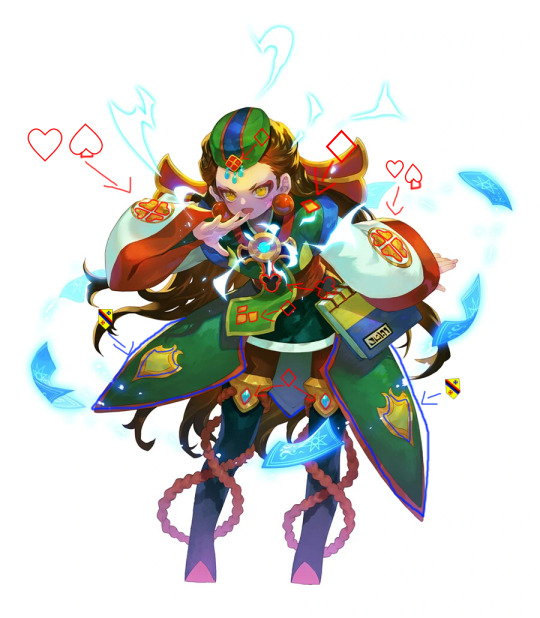
As a fortuneteller with a bit of a priestess or mage gimmick to her, Ryeo’s character design invokes the imagery common with fantasy mage and priestess-type characters, from the long, baggy sleeves and robes to the fancy jewelry that she dons, and even the ropes that circle around her boots, which levitate as though moved by an unseen magic force. Of course, her specialty in tarot isn’t forsaken either in her character design—not only does she wield a tarot book as her weapon, but card suit motifs are subtly woven throughout her design. There’s the hearts and stylized spades on her sleeves, the diamonds on her headpieces, sleeves, boots and tie, the bottom part of her portal amulet’s mantle appears to be loosely based on a club, and even the shield-shaped pleats and stylized shields along her skirt work their way into the design, as shields as used in the place of spades in the Swiss-German card suits. As the modern card suits have their roots in the ones used in the Minor Arcana of tarot, the card suit motifs are a subtle way of showcasing her favor for tarot cards.
But, there’s another major influence in Ryeo’s character design that I’d be remiss to exclude—her Korean heritage. Given that she has a Korean name and her title calls her prophet of the east specifically, it’s all but outright stated that Ryeo is Korean, and this is reflected in her character design. For starters, her portal master attire seems to be inspired by hanbok, the traditional dress of Korea, in some aspects. The sleeves and top seem reminiscent of older hanbok styles favored by nobility and the upper-class, which were generally looser and baggier compared to the snugger fits seen in modern styles, but the short top brings to mind more modern-day styles and the kinds of hanbok favored by common civilians.
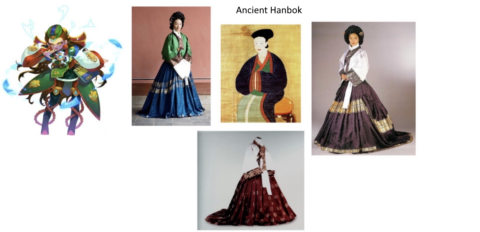
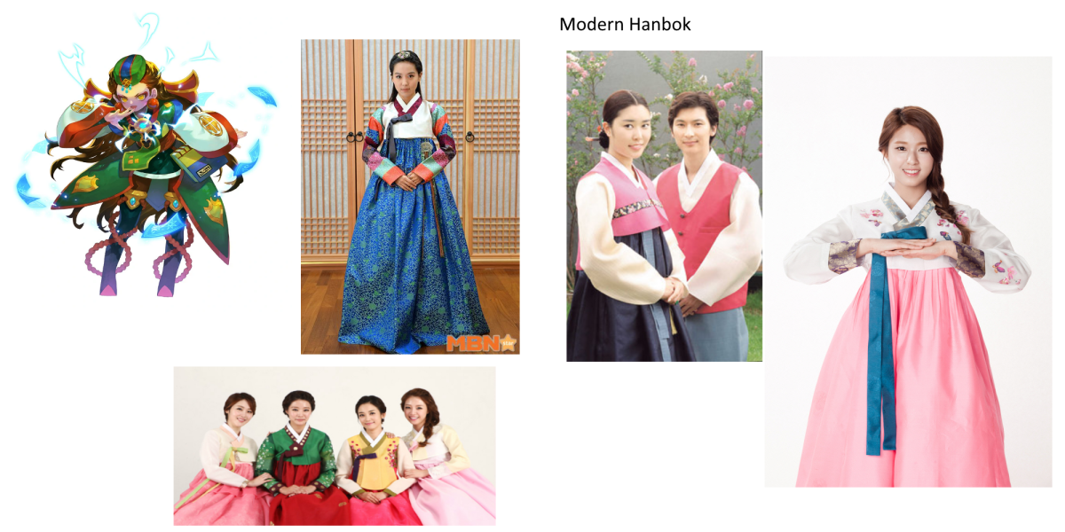
As you can see, the top half, with its long, bulky sleeves and layered tops puffed up by the tight belt and the long skirt underneath bring to mind a more stylized take on hanbok. But, more than that, let’s take a look at her color scheme—and how it ties to obangsaek, or the five traditional colors of Korea, and ogansaek, the colors made from them.
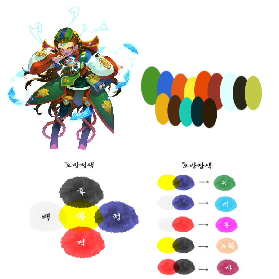
You can find four of the five obangsaek colors, as well as two ogansaek colors—green and sky blue—in her character design. While there’s no white outside the whites of her eyes, considering that the pages of her book are colored in the same mint greens used to accentuate her outfit rather than white like one would expect, it’s plausible they may have used mint green as a substitute for white to better blend with her color scheme, and that the peach of her skin could quality for a third ogansaek color, but I digress. They even have her yellow portal amulet rested on the center of her top, giving a nod to how in obangsaek’s five orientations, the color yellow is associated with the center direction! Another interesting point is that her signature color is green, which, while technically an ogansaek color, is oftentimes associated with blue, as in the Korean language, there isn’t really much of a clear cut distinction between the two colors. In a sense, it’s both a primary and a secondary color, much like how green is sometimes considered a primary color here depending on the light spectrum used. Thus, her green coloration fits within the primary colors themed used in the color motifs of the original four portal masters!
Ryeo’s Korean heritage is a prominent influence in her character design, and it does make quite a bit of sense. Com2us is a Korean gaming studio, and as the new portal masters essentially took the place of characters meant to serve as self-inserts for the players, I imagine Com2us wanted to sort of carry on that spirit by having portal masters to represent different groups of their playerbase. And again, with them being a Korean studio and Ring of Heroes having a sizable Korean playerbase following the game’s launch, it’d make sense that they’d want to rep their players back in their home country with a portal master like them.
And now that we’ve talked about Ryeo by herself, let’s compare her design with some of the other portal masters—particularly the ones she was revealed with.
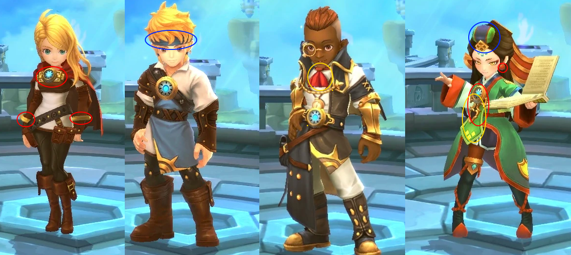
What’s curious about Ryeo is that compared to the other three portal masters, she doesn’t really have a lot of design similarities outside of the basics that all three follow. She does have headwear like George, a plaque for her portal and jewelry like Eugenie, and neckwear like Bruno does. But other than that, her design sticks out like a bit of a sore thumb. Compared to the others with their battle-ready rpg hero aesthetics, she leans more into magical and mystical mage styles, with her clothes being much baggier and looser and notably lacking in the armor that the others wear, unless you count the headpieces and jewelry. And even then, those lean less into a heroic aesthetic and more of a decorated, magical aesthetic. It’s almost as if she was designed with an entirely different aesthetic in mind compared to them, as if there was someone else intended to be her counterpart… A character that has, or appears to have similar inclinations in magic… Wait a minute…
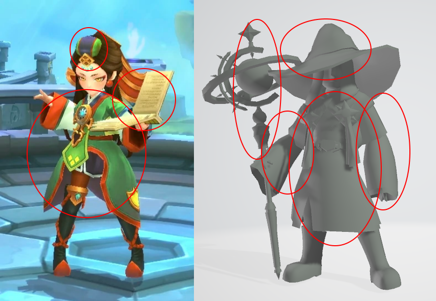
So, uh, was Nine designed with the intention of being a sort of counterpart to Ryeo? Was it just a coincidence because of their overlapping character motifs (Wizards and mages/priestesses)? Well, we’ll probably never know seeing as how Nine was never released, but it’s definitely a possibility.
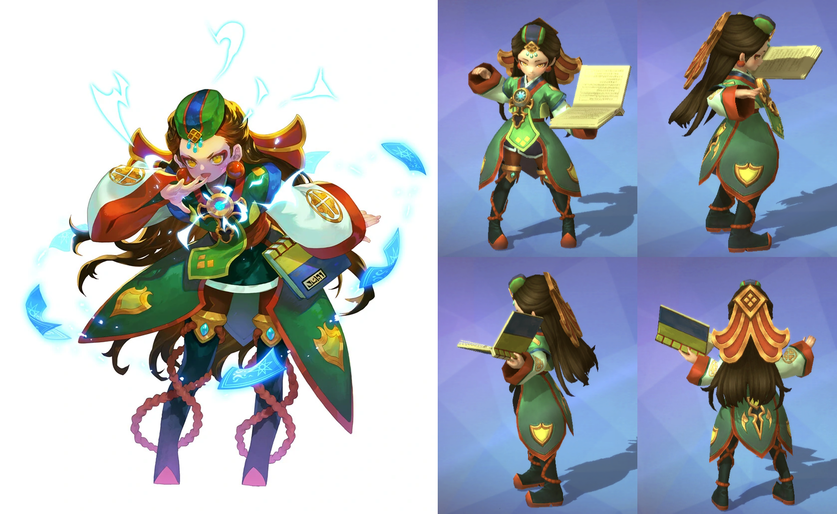
And to cap this analysis off, a comparison of her initial promotional art with her 3D model from the final game.
-
Her hat and earrings are much larger in her promotional art.
-
The plaque at the top of her back headpiece is either set lower or missing altogether.
-
Her hair seems to be longer in her art (though that may be because she’s bending down).
-
Her sleeves are depicted as angel sleeves specifically in her art while they’re just kind of oversized/baggy in her model.
-
The diamond headpiece on her hat is larger and with a thicker border and design.
-
The ropes around her boots sort of float around them in the artwork, while in the model they’re directly tied to her boots.
-
The tips of the shields on her skirt are slightly taller/more pointed in her artwork,
-
The front pleats of her skirt are sort of connected in her model, while in the artwork, they feed directly into her belt.
-
The strap keeping her tarot book attached to her belt is missing in her model, which just has her hold her book instead.
-
The book’s pages also appear to be yellow rather than mint green.
-
The miniskirt underneath her dress is a single solid skirt in her artwork, but is divided by the markings in her model.
-
Her belt is thinner and shorter in her model compared to her artwork.
-
The diamonds on her tie are a regular yellow instead of gold, and in general most of her outfit’s colors are lighter or more subdued.