Ramblings About the Ring of Heroes Portal Masters Part 3: Bruno
(This is a cleaned-up repost of a set of essays I wrote in 2022)

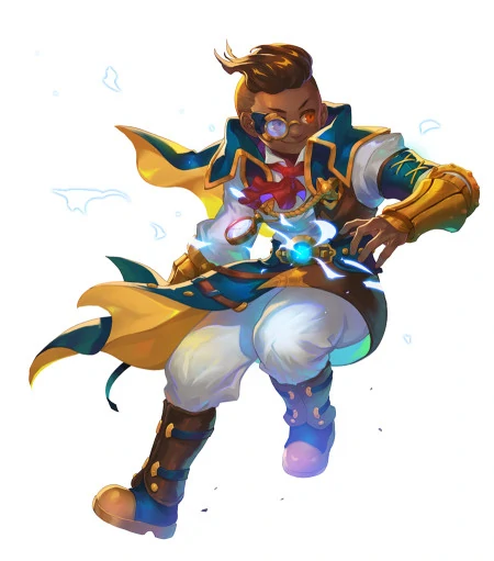
For this section, I will be talking about Bruno, Troublemaker Clockmaker and the very first original portal master introduced in the revamp. A clockmaker who can wield time as he pleases, bending the limits of the temporal continuity for his own pleasure, a gift people would kill to have that comes with a great deal of risk and responsibility… And he uses it to pull pranks. I love this kid. He and Ryeo were both revealed simultaneously via Com2us’s revamp roadmap notices, but of the two, Bruno was the only one to make it into the initial revamp update, something that will be somewhat relevant down the line. Now, let’s not waste any time (pun intended) and delve into his character design!
As someone with control over time, clock motifs are woven into Bruno’s design, from the pocket watch he wields, the horologist’s loupe atop his face and even the clock symbol on the back of his cape (not pictured here). Even further into it, his portal master attire appears to be influenced by a 19th-century, loosely steampunk- or clockpunk-esque aesthetic—his little ascot tucked into a puffy dress shirt, the fancy vest with the pumped-up lapel and sharp dress shirt bring to mind a dapper Victorian gentleman, but mixed with the long cloaks, golden gauntlets, copious belts, work-ready boots and sturdy satchel give it a more industrial edge. The heavy steampunk aesthetics complement his whole clockmaker theme, and give it a uniquely elegant edge compared to more generic mechanic aesthetic, but in addition it also blends well with the settings of Skylands—steampunk and fantasy have a lot of crossover with each other, making a steampunk-inspired character fit right in with the high fantasy Skylands. But, in addition, the use of steampunk/clockpunk specifically is also intriguing because compared to its contemporaries in technology-based subcultures and aesthetics, steampunk is generally recognized for a basis in optimism and curiosity surrounding technology, a subculture that fully embraces the wonders and mysteries of technology and science, that wholly encourages going new places, making new things and finding out all their little quirks. Bruno, in his backstory, is first and foremost characterized as two things—being good with clocks, and being upbeat and kind of mischievous. So, a steam/clockpunk-inspired aesthetics fits him twofold, first for his own affiliation with clocks and time, and then for his cheerful demeanor. The bagginess and looseness of his clothing, as well as his motif color being yellow—a color traditionally associated with happiness, youth and energy—also gives him just a hint of a playful air, fitting with his character being a laid-back mischief maker.
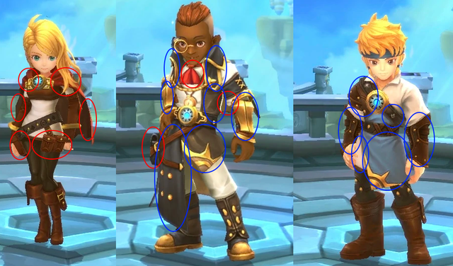
Another thing of note is the similarities between his design compared to the other three initial portal masters, particularly Eugenie and George.

While they all share the same basic design elements for their respective groups, Bruno also has several similar design elements to Eugenie and George! He and Eugenie both have capes and satchels of some kind as well as a red cloth accessory on the upper region of the body (Eugenie’s cape and Bruno’s ascot, which notably is also the only red thing in his character design), while with George he shares the gauntlets, the long, flowing cloths over the lower region of their bodies, the sun patterns on their skirts and the additional decoration to the upper region of the body with George’s shoulder armor and tunics and the brown tunic stitched into Bruno’s shirt as well as his fancy vest. This is relevant because these three were the initial three portal masters added to the game when it was revamped (Ryeo was revealed in the original revamp announcements and development talk, but she wasn’t added into the game until its first post-revamp update), so they’re treated as a bit more close-knit, with Bruno having design elements complementary to both of them to make them all seen a tad more connected. In fact, with George and Bruno sharing many more design elements by comparison, it’s possible they were designed with the intention of being seen as complementary or counterparts to each other—which makes sense as they were the first two boys of the group.
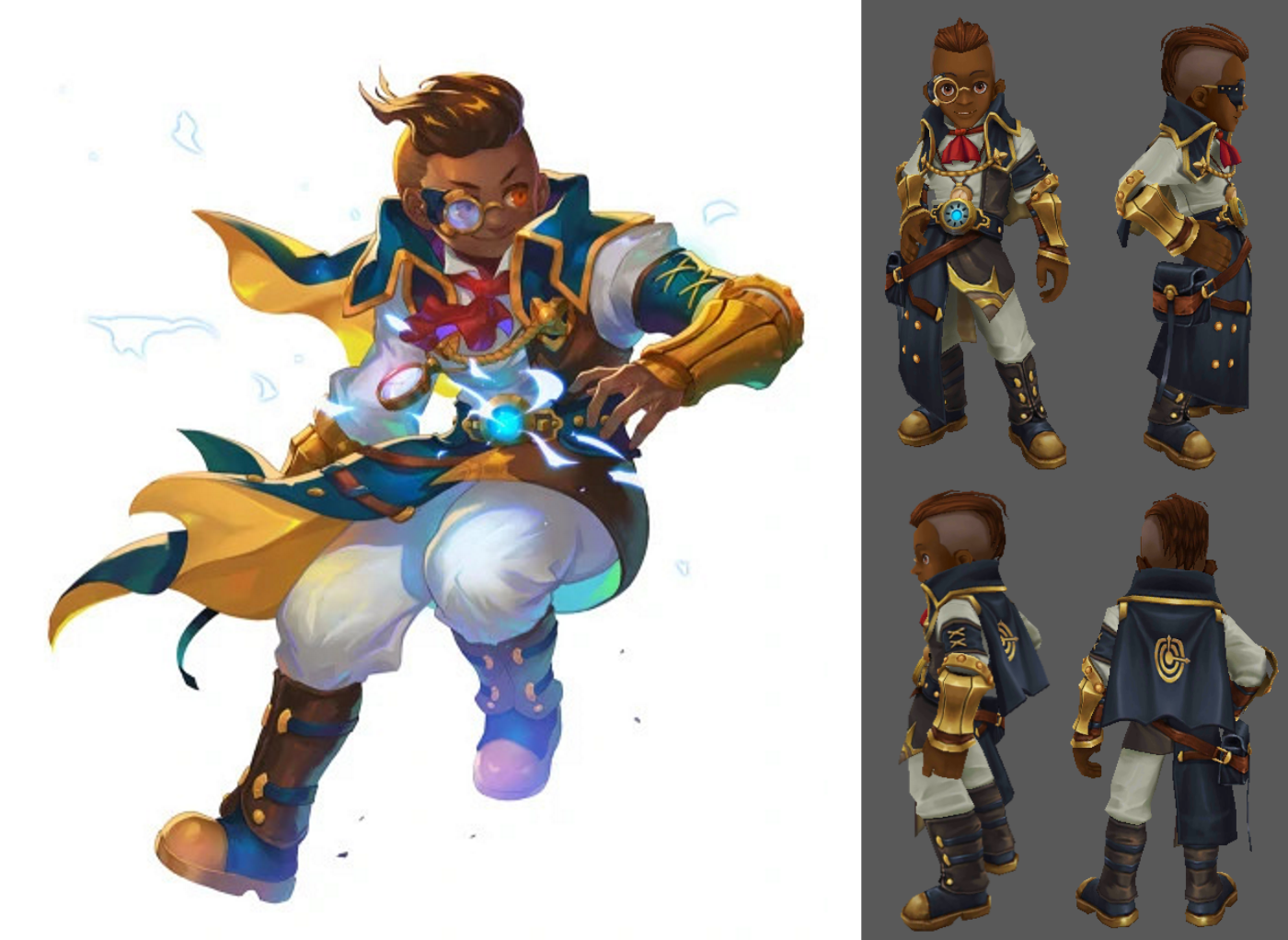
And as a bonus, a comparison of discrepancies between his artwork and model!

-
The blue parts of his outfit are a darker and duller shade of blue that’s almost black in color, in comparison to the dark but rich teals of his artwork, and the browns similarly are darker and duller as well.
-
The golden dots on his loupe’s handle are missing in his promo art.
-
The gold squares on his belt buckle/portal amulet plaque are missing in the 3D model.
-
His gauntlets are gold with brown undertones and dark blue belts as opposed to the solid gold that they were in his promo artwork,
-
His model’s eyes are a light brown while in the artwork they appear to be orange instead.
-
The sun symbol on his tunic’s skirt is a mixture of gold and brown as opposed to being solid gold.
-
His hair is seemingly a bit shorter in his artwork compared to his model, is styled different (it appears to be more loose and flowing, while in the model it is slicked back and straighter), and in the model, his hair is a lighter shade of brown compared to his artwork while the shaved part is more of a paler, grayish color as opposed to the brown color it has in the artwork.