Ramblings About the Ring of Heroes Portal Masters Part 2: Eugenie & George
(This is a cleaned-up repost of a series of essays I wrote in 2022)
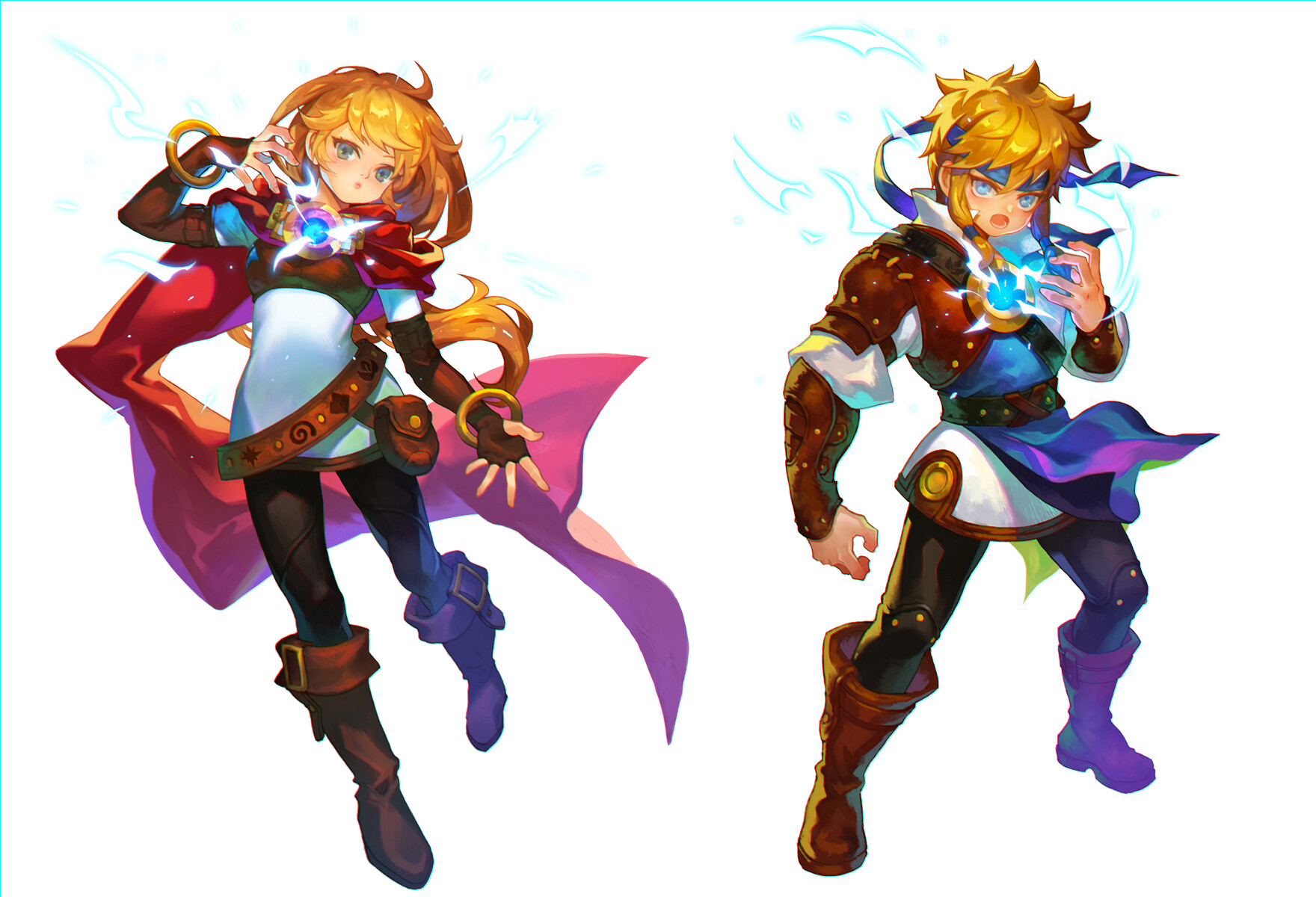
For our first section, I will be tackling Eugenie and George together, as due to their shared history and wealth of similarities, it makes much more sense to analyze them as a duo rather than individually. So, before us stands Eugenie, Treasure House of Knowledge and formerly the default girl portal master from version one, and George, Shield of Protection and formerly the default boy portal master from version one. A brainy but lonely girl whose biggest escape was her passion for reading that found herself embarking on a journey just like the ones in her favorite books when she arrived in Skylands, and a dutiful, responsible boy who wants nothing more than to protect and care for his beloved younger sister, who fights for the sake of returning home to make sure she’s alright. Let’s take a look at these two, and how they fit into the DNA of Ring of Heroes as whole!
The two of them have been intertwined from the initial conception of Skylanders Ring of Heroes, with their designs being taken from the default designs for the customizable portal masters from Version One and reworked into proper characters. So, in a sense, it’s kind of a reverse of your usual character design philosophy—their individual names, personalities, and backgrounds all came after their designs did, rather than before or around the same time. As a result, it could be argued that the very fabric of their character was stitched into their design afterwards, a patch added to the quilt a bit after its completion because the other one frayed. Their shared character motif is RPG heroes, and in keeping with this, their designs both have a very heroic air to them—with Eugenie’s long cape and belts and George’s armor, sash, headband and knightly tunics, they feel very evocative of the kinds of protagonists you typical see in high fantasy media. That’s especially fitting for them, as after the player themself it could be argued that Eugenie and George were intended to be the protagonists of Ring of Heroes post-revamp. After all, not only were their designs lifted from the original portal master avatars which represented the player—or the main protagonist of the game—but they’re the very first portal masters you get in-game. (Eugenie was the portal master all players would get when they started playing post-revamp, and George is the first to be unlocked after her), and they’re the ones who would crop up the most in official art and promotional material. Heck, they’re the only two who showed up on the website and title screen art, and in the loading screen you get when you first start the game and go to the introduction, it’s Eugenie and George who you see first.
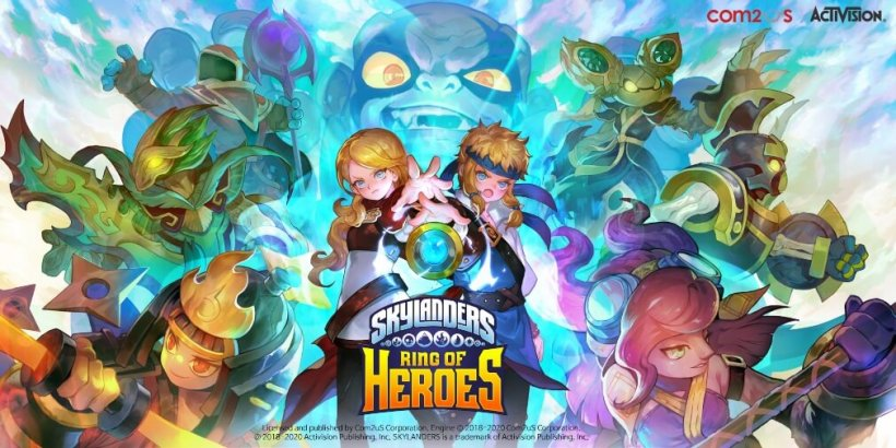
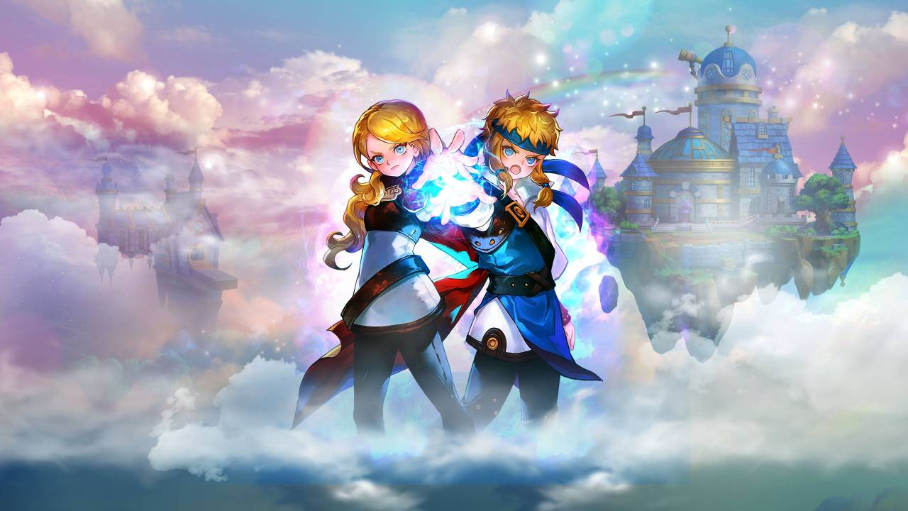
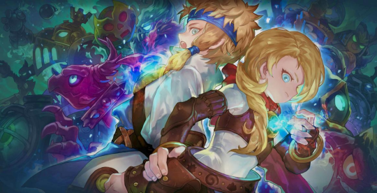
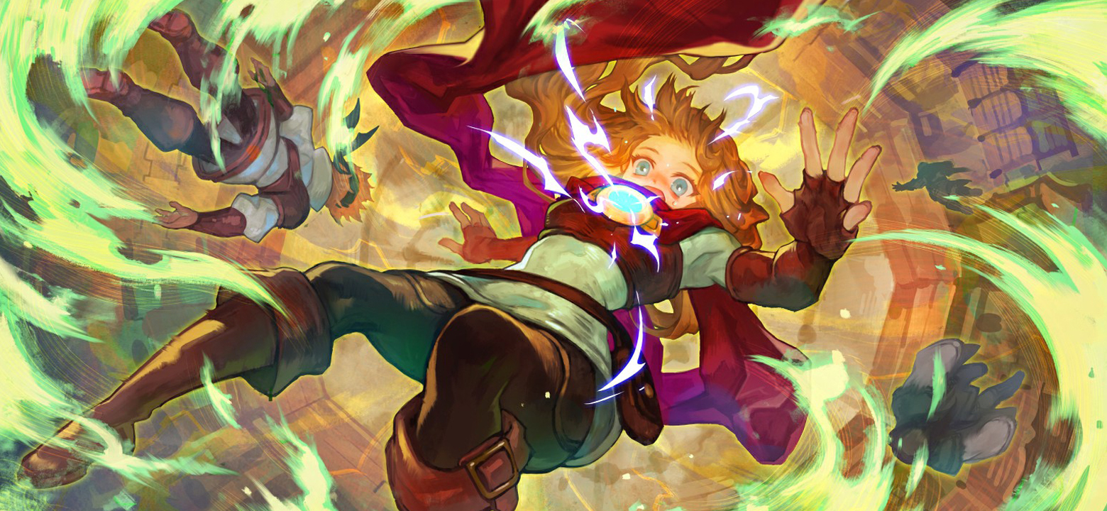
As counterparts to each other, they both lean into different aspects of the standard rpg hero—with her long, billowing cape in its bold and striking shades of red and her belts with their handy little pouches for storing things, Eugenie feels very reminiscent of an adventurer, in keeping with her backstory and how it hints that for her coming to Skylands was a new adventure and an escape from her stressful home and school life. Conversely, George leans more into the heroism aspects of RPG heroes, with the armor he wears, his almost knight-like tunics and his fancy warrior’s headband all being evocative of a knight or some other kind of warrior—fitting well with his background emphasizing first and foremost his love for his loved ones and his desire to protect them from harm, particularly his beloved younger sister. Even their theme colors emphasize this, with Eugenie’s bold and striking red cape contrasting the cool blues peppered throughout George’s design.
Though they contrast in some aspects, their designs complement each other in many others, to the point where they could easily be seen as slightly tweaked and flipped versions of one another. Same skin, hair and eye colors, their outfits sharing an identical color scheme of brown/white/yellow with an accent color, they have the same elemental sashes, same long and flowing cloth on the upper region of the body, a layered top, and styled hair sides (Eugenie’s braid and teased sides and George’s side ponytail… Thingies). The two of them are two sides of the same coin in character design, the mirror images of each other if you will. This makes sense, considering that being the original protagonists they were likely designed with the intention of looking complementary to each other.
But what of the other portal masters, and how do they relate to our portal master duo? Well, let’s take a look at them compared to Bruno and Ryeo, the other two portal masters revealed for the revamp.

Though their designs deviate a bit from Eugenie and George’s, some more than others, they have a few extra common links that aren’t shared with Adriana and Oscar. Namely, each portal master being associated with a signature color that commonly pops up in their design, their portal amulets being attached to some kind of peripheral accessory as opposed to the clothes themselves (Eugenie’s plaque, George’s sash, Bruno’s belt and the mantle on Ryeo’s tie), and each of them having some kind of cloth specifically over the lower portion of their bodies, as opposed to another article of clothing. Even their theme colors all link them together as a group—Eugenie’s red, George’s blue and Bruno’s yellow are all primary colors, and Ryeo’s green, depending on the kind of color system used, is often considered a primary color as well. The four of them are essentially designed with the intentions of being viewed as a unit, even moreso compared to the general philosophy of how they approached portal master design as viewed above. After all, when the game was revamped, Bruno and Ryeo were the very first taste of the newly-revamped portal masters players were receiving, considering that Eugenie and George were reworked versions of the Version One avatars, so they really had to sell them as a group, making sure the new ones fit with the old ones and all that. These subtle connections make them feel like part of a team while still being able to stand alone as characters.
But, there’s another character with character design connections to Eugenie and George I’d like to point out—Master Eon himself, the epitome of good portal masters before the player came along and our mentor in portal mastery.
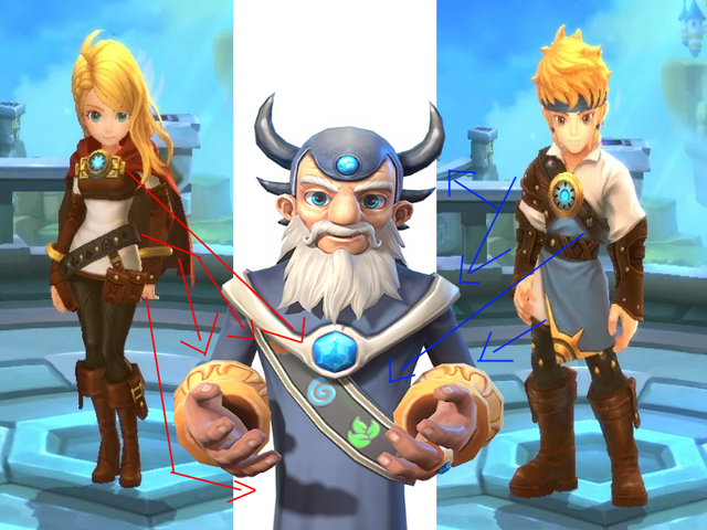
In a ways, it seemed like they may have taken a few loose cues from Eon’s design for them as well, with the long, flowing tunic for George and shirt/dress/whatever Eugenie’s top feeling like a more battle-ready version of Eon’s robes, and both of them bearing sashes with the symbols of Skylands’ elements like Eon does. In addition, they both have their own unique Eon-inspired elements with Eugenie’s bracelets and cape/plaque with portal hybrid matching Eon’s gauntlets and mantle, and George having blue as a prominent color like Eon does and both wearing some kind of armor, whether it’s George’s chest armor and gauntlets or Eon’s helmet and mantle. Considering that they originated as avatars for the Earth portal master, who is, for all intents and purposes, Eon’s successor as a heroic portal master, it makes sense that they’d want to put in some subtle echoes to Eon’s design. What’s especially interesting to me about George in particular is that his signature color is blue, the same color heavily utilized in Eon’s design. In a sense, it was almost like they were trying to give him in particular a closer connection to Eon, which, when considering that George himself was a bit more heavily billed as Ring of Heroes’ psuedo-protagonist by virtue of being used as a substitute for the player in cutscenes as the boy portal master avatar in Version One, makes a good bit of sense.
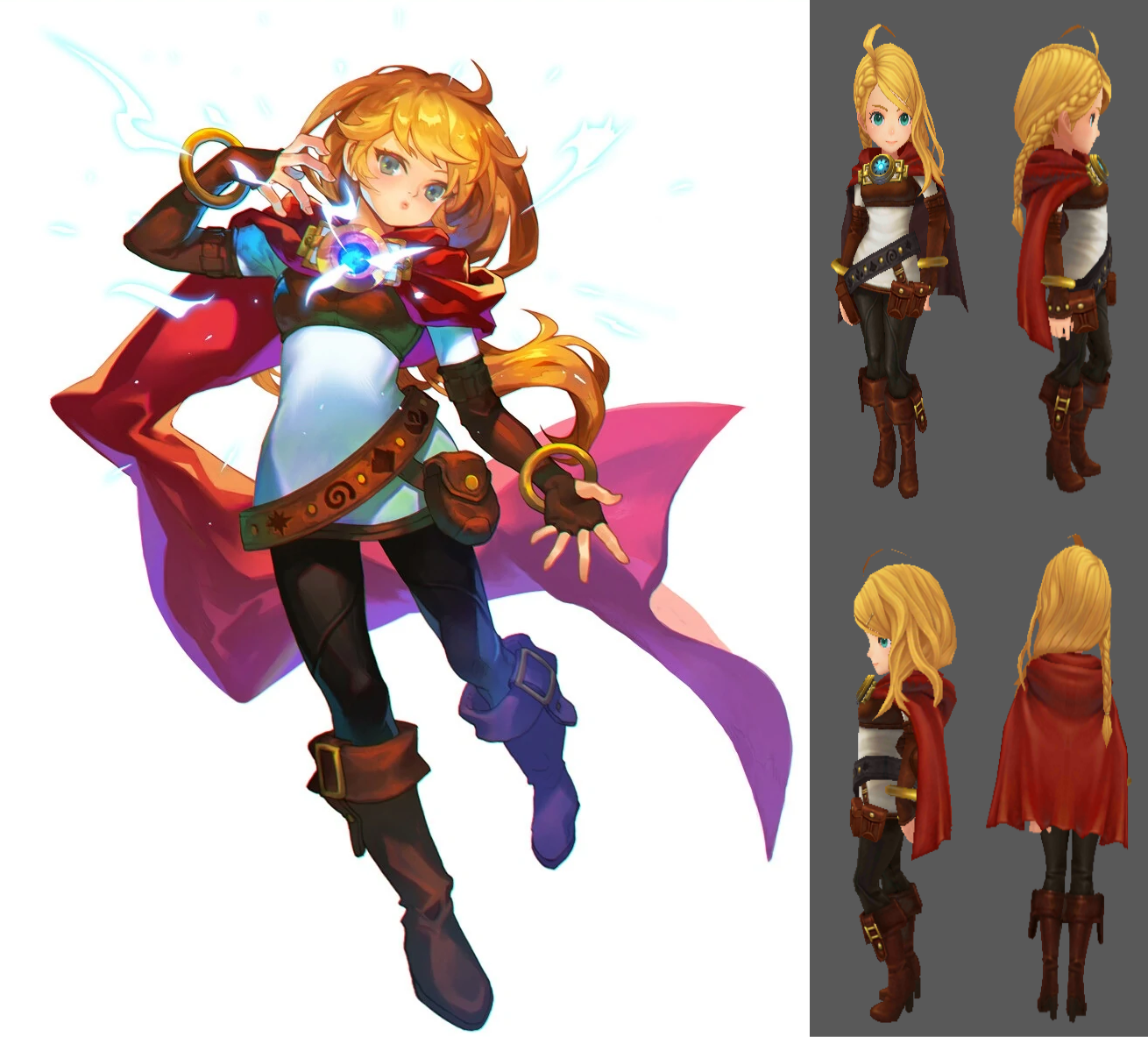
Also, as a bonus—when the revamp was still in production, the initial four portal masters all received fancy promotional art for their reveal in the revamp roadmap notices. However, upon comparing them to their 3D models in the final revamped game, it’s clear that there’s a few discrepancies between them. To give an example, here’s Eugenie’s.
-
Her cape and hair are much longer in her promotional art than her model.
-
Her belt is a different shade of brown compared to her artwork.
-
The little yellow dots on her gloves are missing.
-
In the artwork, she has one large pouch, while in the model, she has three medium-sized pouches instead, and the pouches are also of different shapes as well.
-
Her cowlick in her model appears to be missing in her artwork.
-
In her artwork, her boots have flat soles, but in the game model, they have heels instead.
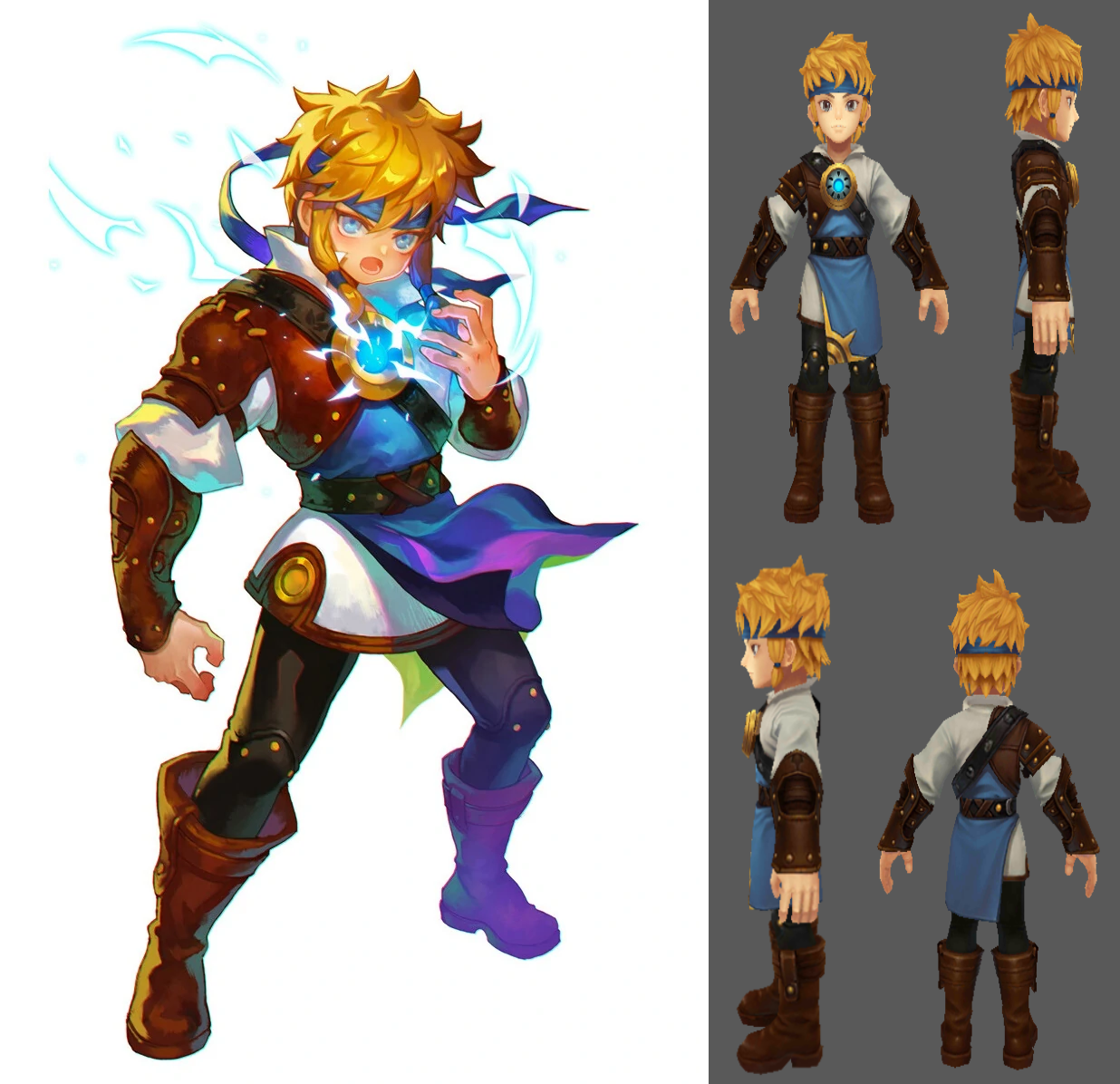
And here's George's.
-
The sun detailing on his blue tunic’s skirt is missing in his artwork.
-
His headband and the sides of his hair are a bit longer compared to his model.
-
His armor, the accents on his tunic, and his boots are darker shades of brown compared to his artwork.
-
His shirt’s collar appears to be just a bit shorter/flatter in his model compared to his artwork.